Wednesday 26 May 2010

More totally inappropriate shoes


We all must be aware of Naomi Campbells infamous stumble on the catwalk in a pair of ridiculously high platforms! If supermodels can't hold themselves up in the beauties then who is the public to stand a chance with them??


Beauty is pain?


New fashion skates? Shoes are never failing to add the shock factor and this pair just prove my point exactly!


Pricing

After receiving a lecture on the introduction to zines at the beginning of this project, we were informed that the average price for a zine out their in the market is £4-£5.
From looking around at prices of magazines in the current market, it seems that most gossip glossy's such as Cosmpolitan, Glamour  and Company magazine are all retailing at around £2-£3.

However, because our whole zine is made up of hand drawn illustrations on each page, we feel that our zine owns a much more personalized and collectable feeling about it, and so therefore felt it would be acceptable for us to price our final zine at £4. We hope this is a hit with any possible fans we manage to attract at the London Zine Symposium and our hard work gets rewarded with our work finally getting out into the wide world.

Shoes. Shoes. Shoes


Because both me and Nat agreed that shoes are a nightmare when it comes to looking glam for a night out, this subject matter is going to appear in our top 5 annoyances within fashion without a doubt.

These shoes just prove how us women would easily be persuaded to buy a pair of shoes just from looking at them and thinking WOW. Don't get me wrong, these shoes are absolutly amazing, however i would not like to even attempt walking a pelican crossing in these as i think i'd need three sets of red lights to even just get half way across!

Promotion of Zine- It's a Knock Out Collaboration


Because we want our zine to be a fun and humorous read, we wanted to reflect this in our communications campaign aswell. By creating a 'Its a knockout' inspired event in Nottingham this coming summer, we feel it is the perfect event to match the zines essence of a humorous way to de-stress and de-clutter you annoyances.

Teams could be grouped according to similarities of annoyances, i.e the tangled wires team, the empty turned on plug socket and the chav despisers, and all groups could battle it out in a variety of stress relieving fun activites.
On the day we could supply a giant white board where members of the public can contribute what annoys them and this could inspire content for future editions. Designated interviews could also be present on the day to interview those who have interesting and unique annoyances which we could also run articles and features on in up and coming zines.

Charlie Brooker

Charlie Brooker is a Guardian columnist. He currently writes Screen burn, a G2 comment piece every Monday and he produces, writes and presents Screenwipe for the BBC


With the same humorous and witty tone of voice we're aiming for in our magazine, we decided to take a look into some samples of his work for inspiration for how to voice our opinions on annoying things in society today to our target demographic.

He keeps his sentences short and to the point to get the humour across quickly and prompt as to not dampen the humorous point he's trying to make. The tone he writes in is exactly how you would imagine him to speak it to you in person, which almost makes you feel more involved in the text as such. He is also a fan of using brackets to include his own thoughts and rhetorical answers from points he makes, which re-assures us he too has the same thoughts as us and he has answered our questions for us.

Take a look at his work further!


http://www.guardian.co.uk/profile/charliebrooker

A little about Typo.

Typography design is becomming more and more common these days and equally as important to all brands, sometimes it is there to tell a story and sometimes because it just looks nice.
Here are a few i've selected from the 25 inspirational typography designs...


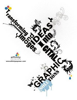
We could imply a tagline for the zine and take inspiration from this image and design and layout the words in a similar way as to provide a quirky and edgy look to the zine and provide some interation with the reader as they get to read on a variety of angles to read the full message.


To add an artistic flare to a magazine, inside or on the cover, it could be an idea to crinkle some paper to add some texture and then splat some paint over it before then scanning the final paper into photoshop to apply text and design on top.


Again lying out text at a variety of angles adds interest to the page. An idea taken from this image is we could create an 's' and 'c' created through words summing up the zines essence and what it stands for. I also like how this typography combines an element of illustration within it too, by adding this i find it gives a personalized, hand finished touch the image, which is definitly to be considered when planning the content for our zine.

Experimenting with different opacities against a coloured background is a great idea and change from using different colours, as it keeps the overall selected one colour and provides text around the page in a variety of diferent shades, almost providing a mysterial appearance.


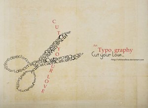
We could create our front cover using the words 'Spring Clean' and using them how they have used 'cut your love' here and arrange them to create a shape which has relevance to our magazine content, perhaps a main feature in the magazine could influence the shape.


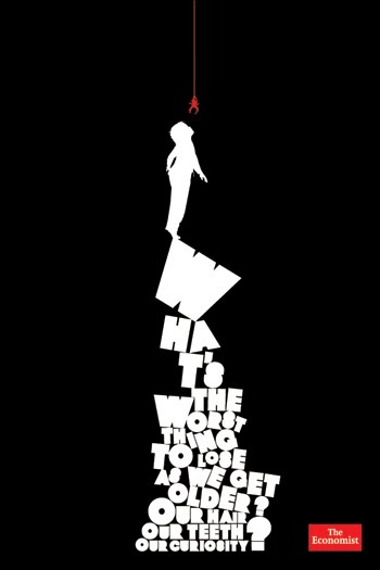
A nice touch to have the title of an article featured in the middle of the main article rather than the standard stereotype top.

Pile of Typo.


A great idea for a front cover-

To have a pile as shown on the economist here made up of the letters spelling 'Spring Clean', this could be a witty resemblance to a pile of rubbish that is waiting to be cleaned up and de-cluttered, just how the magazine aims to de-clutter readers annoyances by voicing them and letting them know they're not alone and can enjoy a giggle at them instead of being uptight.

Final Badge Designs


Our final product- free promotional badges for Spring Clean Zine.

Typography


For the 51st Grammy Awards, the Recording Academy hired TBWA\Chiat\Day to produce a series of typographic illustrations of different musicians to promote their event early 2009. The artist's that were selected for the Grammy typography were Stevie Wonder, Rihanna, Kanye West, Lil Wayne, Coldplay, Thom Yorke and Lenny Kravitz.
With each of them  asked to provide a list of at least 15 songs that inspired their own creativity, in return, each song title provided was turned and created into the graphic design, with the words creating a colourful swirl around the artists heads.

To adapt this to our magazine, we could perhaps write our title for our front cover, with each letter made up of words that describe what annoys us, i.e tangled wires, chavs, bad weather... to produce the title 'Spring Clean'.


Sunday 2 May 2010

FREE BADGES


mock up of potential free badge design for university term 2.